WGCU Public Media
At WGCU, the local NPR and PBS station for Southwest Florida, I worked as a Digital Media Intern, and it’s been one of the most meaningful creative roles I’ve had so far.
I split my time between the website and social media, helping make sure everything looks clean, feels intuitive, and stays updated. That means things like editing the events page, fixing layouts, updating program schedules, making the site work better for visitors.
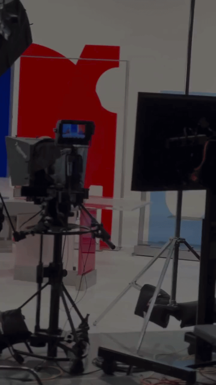
On the creative side, I’ve been producing, editing, and scheduling video content for social, turning full-length stories into short, punchy clips that work on Instagram, Facebook, and LinkedIn. I have designed templates for the social medias and was able to use motion graphics to get our stories across.
I also work across teams, with editors, web programmers, and journalists, translating their ideas into visuals. My role was a mix of design, tech, and purpose, and I’ve learned a lot about how to tell stories that matter while keeping my designs visually strong and on-brand.
One of the most meaningful things I’ve worked on at WGCU was helping edit and design scenes for Rising: Surviving the Surge, a documentary about Hurricane Ian. It hit different knowing how many people around me were directly affected. This wasn’t just a project, it was something real. Being part of the team that brought those stories to life felt like an honor. It made me realize how powerful design can be when it’s tied to real human experiences.
This role has really helped me grow as a designer who doesn’t just make things look good, but makes them work for real-world impact too.
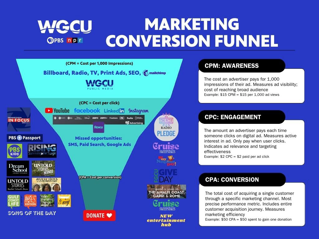

I created this funnel to make WGCU’s marketing performance easier to understand at a glance. It shows how different channels support awareness, engagement, and conversion, and connects each stage to the metrics that matter most.
The top of the funnel focuses on reach through channels like broadcast, print, and SEO. The middle highlights where people actually interact with content across social and streaming platforms. The bottom shows where those interactions turn into real support, like donations and pledges.
This helped the team see where attention was strong, where people were dropping off, and where there were clear gaps, like paid search and SMS, that could be explored moving forward.

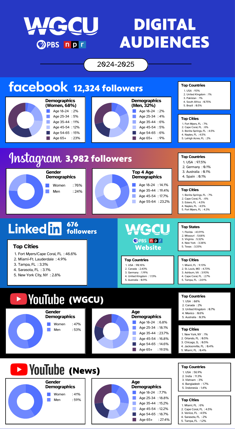
I put this together to give the team a clear snapshot of who our digital audiences are and how they differ by platform. Instead of looking at each channel in isolation, this graphic makes it easy to compare age, gender, and location across social, web, and video.
Facebook and Instagram skewed older and more local, which supported using those platforms for community-focused and donation-driven messaging. YouTube audiences were more balanced and spread out geographically, making it better suited for longer-form and news content. LinkedIn remained small but highly regional, reinforcing its role as a niche, professional channel.
This view helped the team align content and messaging with the audiences already showing up on each platform, rather than taking a one-size-fits-all approach.