
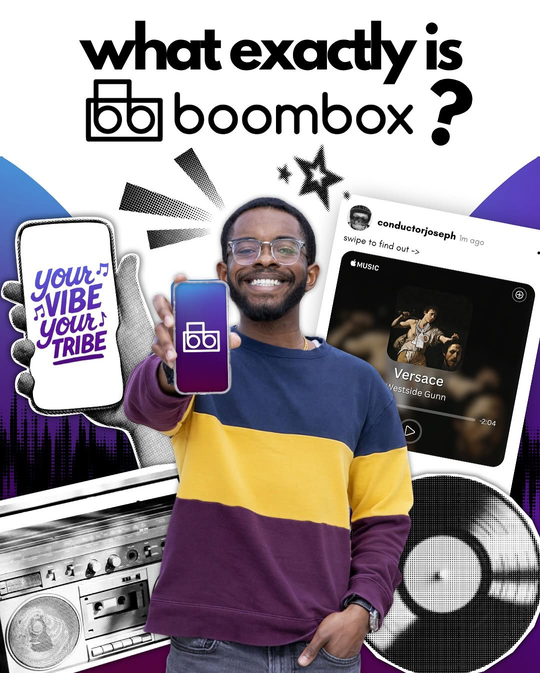
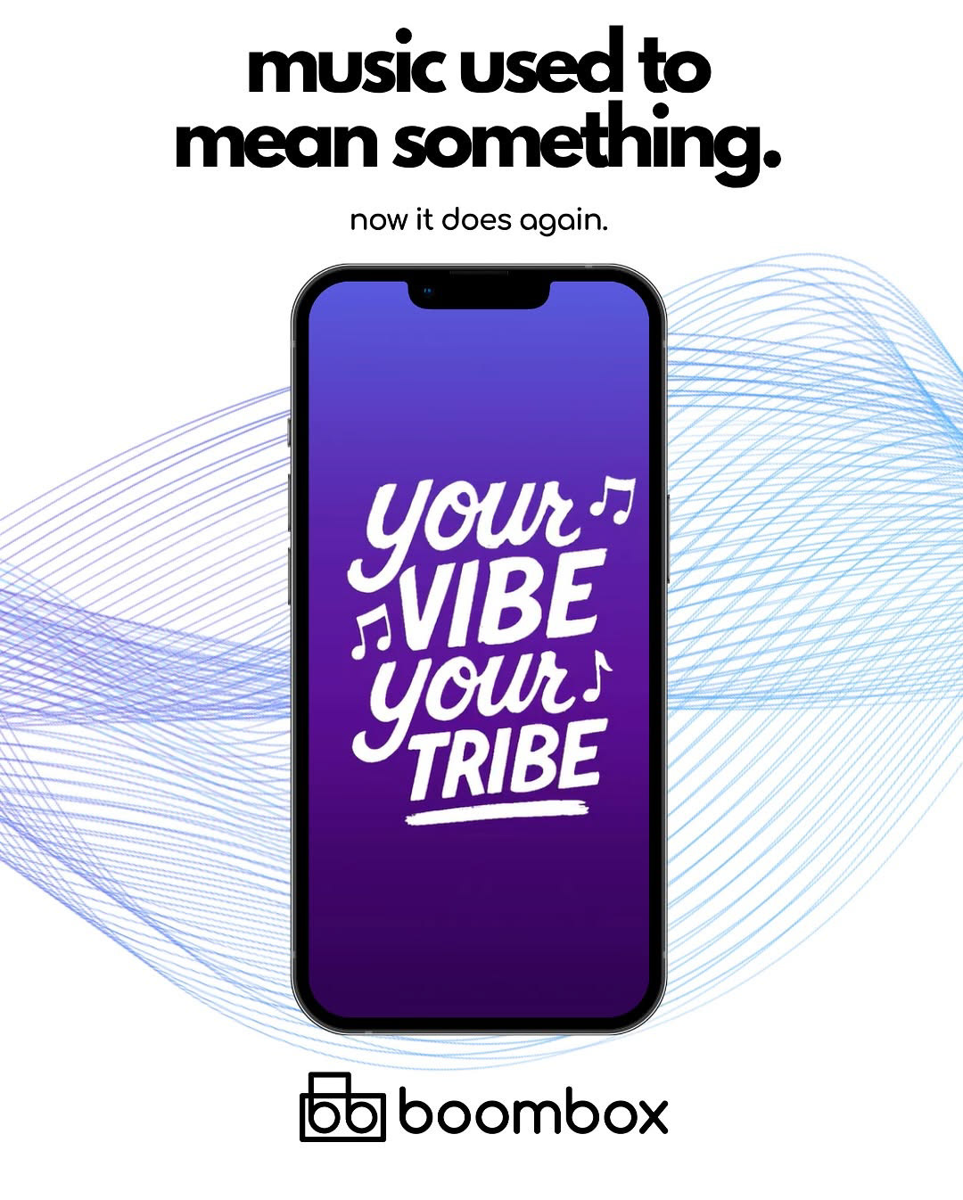
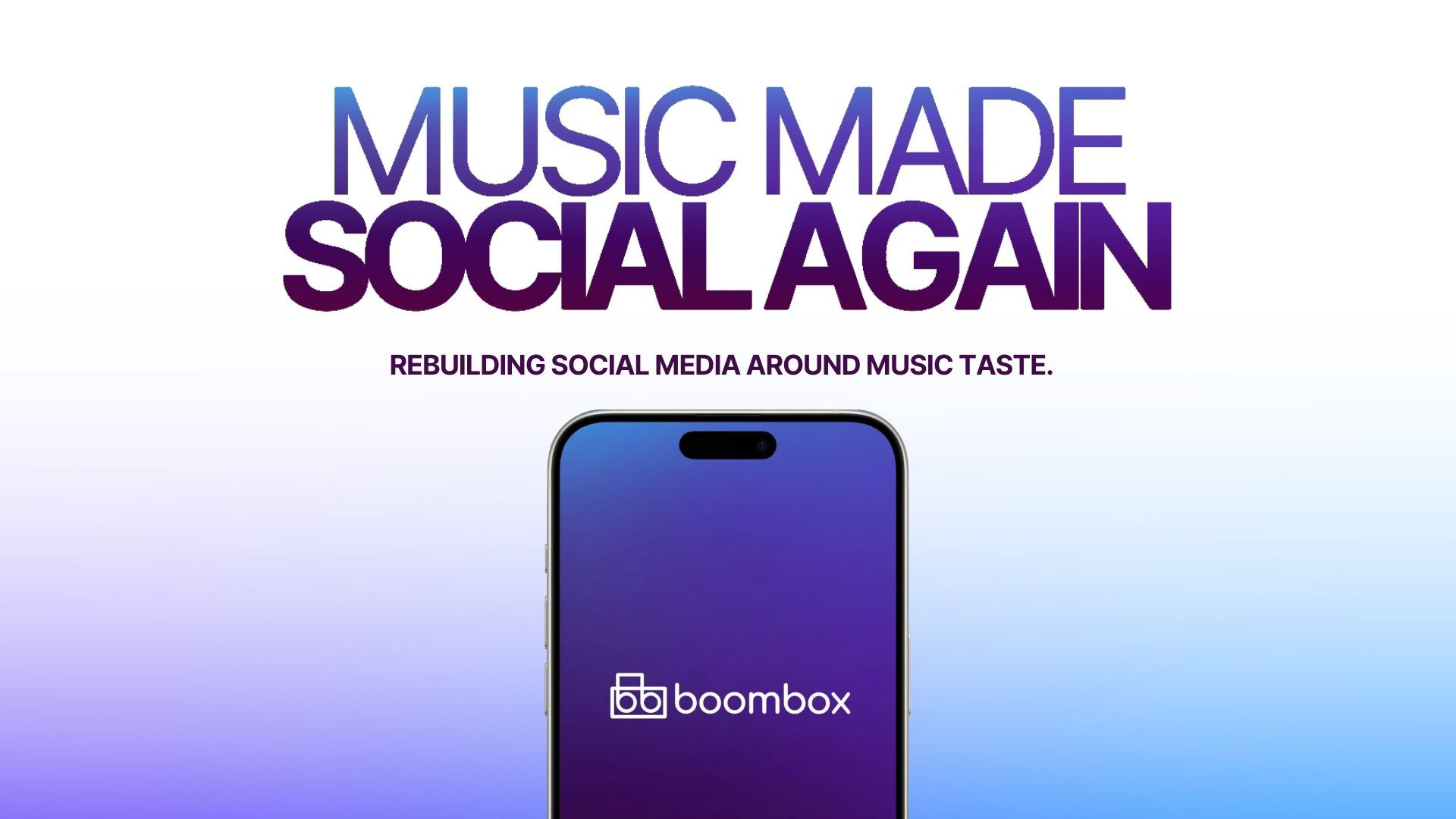
What is BoomBox?
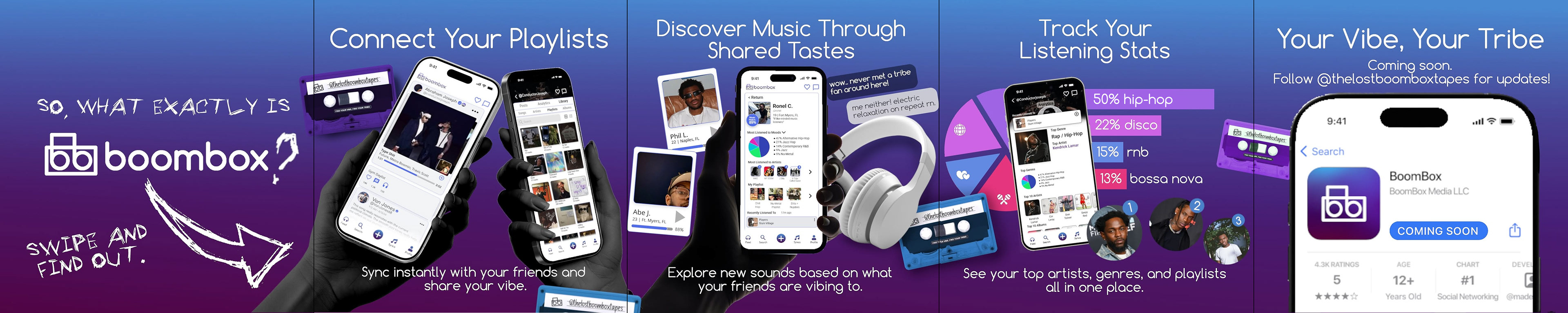
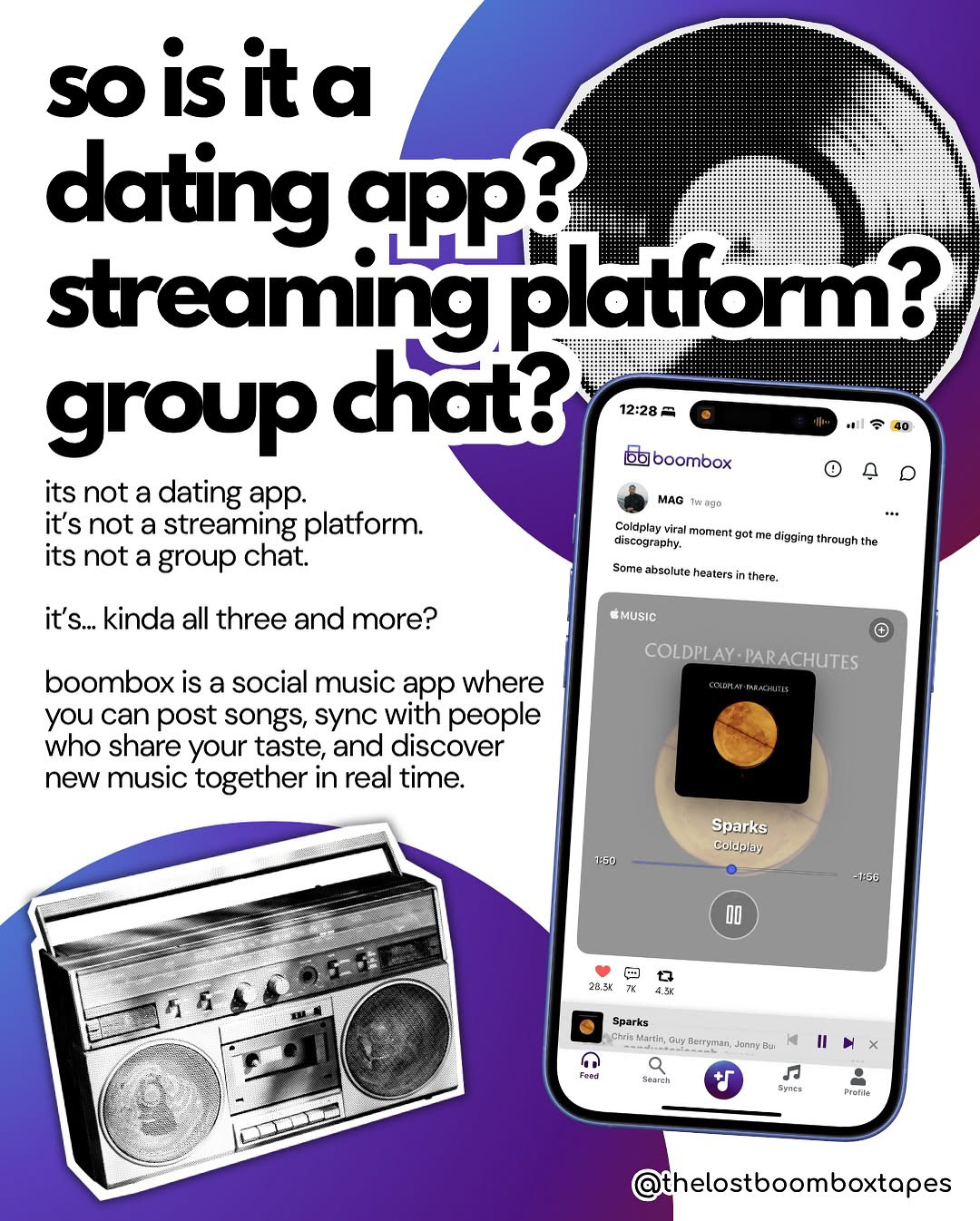
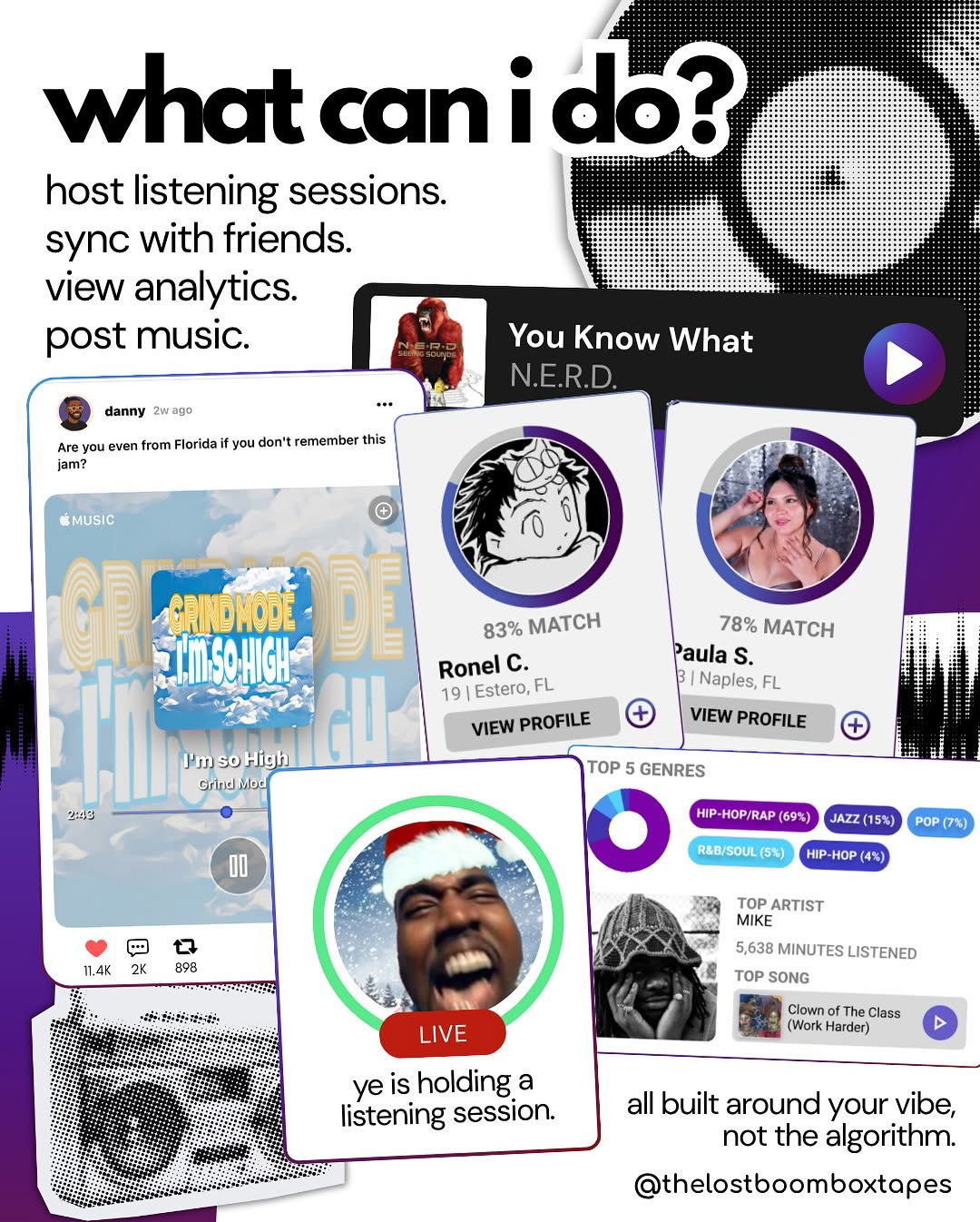
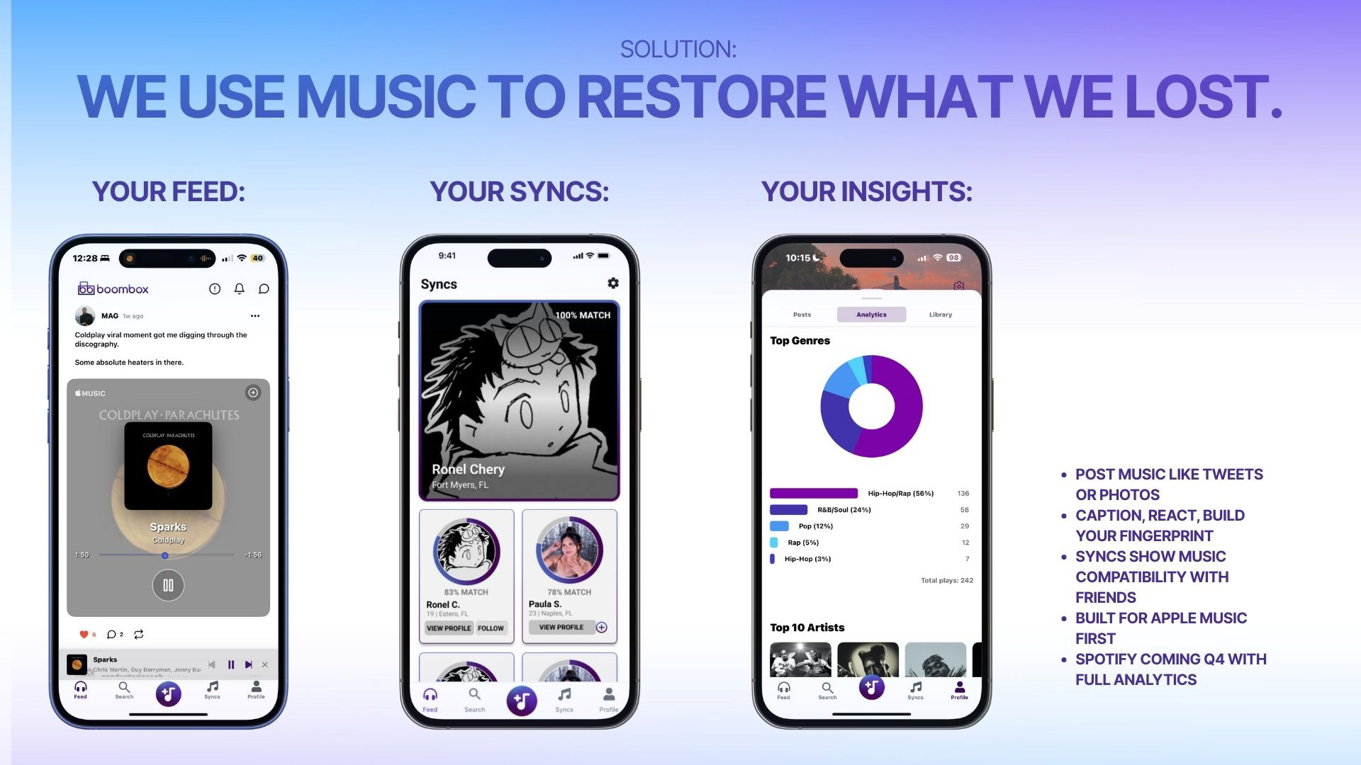
BoomBox is a social app concept designed to help people connect through music. By using playlists, artists, and listening habits as the foundation, BoomBox creates opportunities for users to discover new connections — whether it’s friendships, collaborations, or romantic interests — all through shared music taste.
@thelostboombox on Instagram.
Logo / Branding / Assets
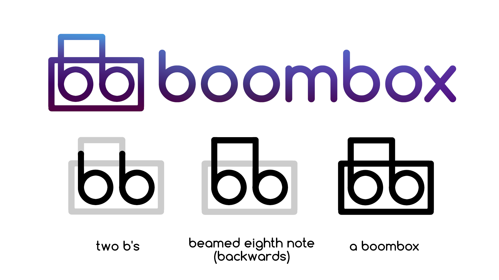
The Boombox logo is a design that I wanted to have hidden meanings to. I wanted it to feel clean and modern at first glance, but also packed with subtle details that tie back to music and the name.
1. It’s made up of two B’s, for BoomBox.
2. The two B's join together at the top and create a backwards beamed eighth note, which symbolizes the music aspect of our brand. Since Boombox is all about connecting through personal taste and self-expression, having the music note reversed felt natural. It’s a nod to doing things your own way, breaking the rules a bit, sampling and remixing what’s original into something new.
3. When you look at the logo a a whole, you will see a boombox: the B's make up the speaker inside the box and the connection at the top forms a handle.
It's simple for an app icon, but meaningful once you know what’s in it.
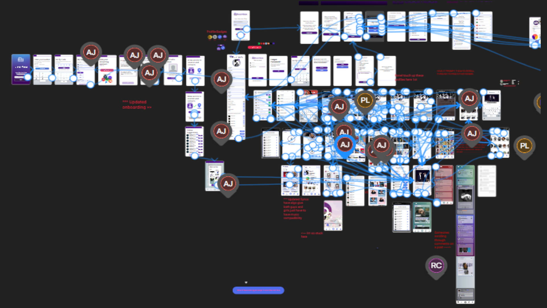
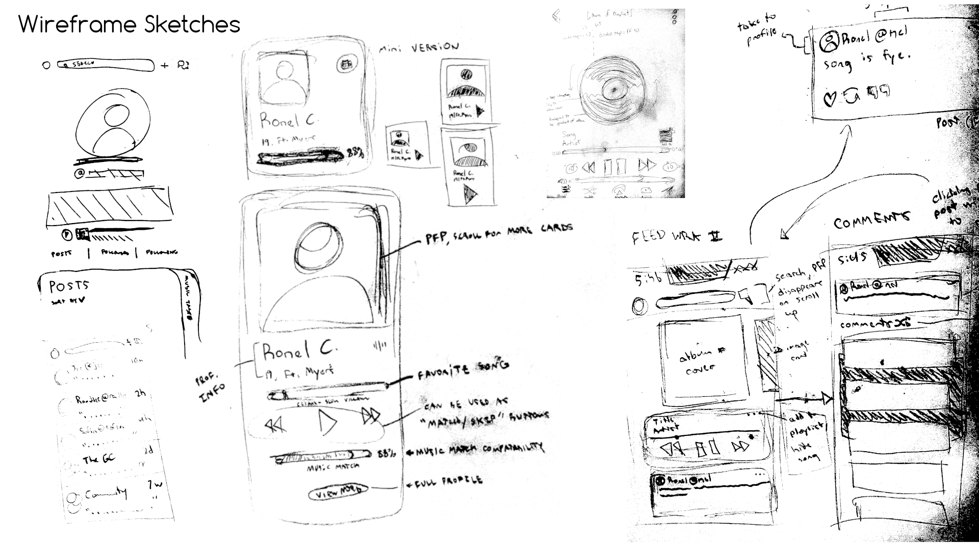
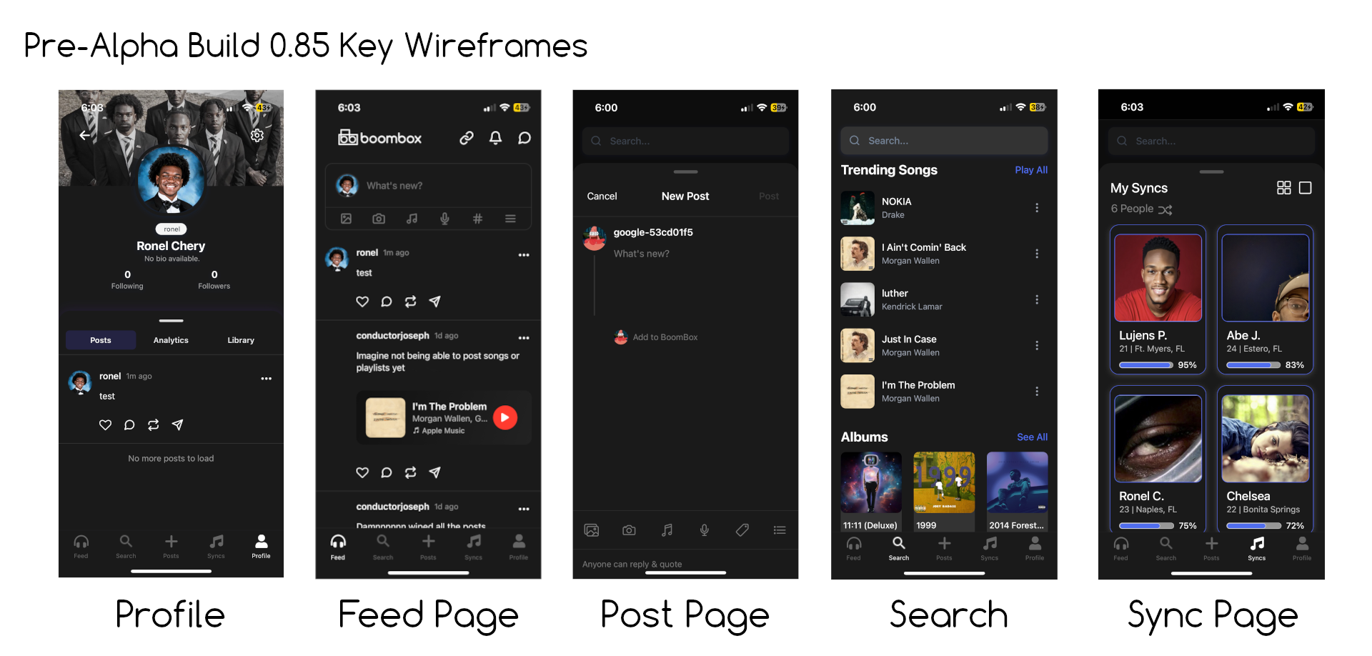
Wireframes
Social Media Marketing / Design
Communicating Design Decisions to Stakeholders
Stakeholders: Investors, judges, product decision-makers
Objective: Secure buy-in through clear storytelling and product rationale
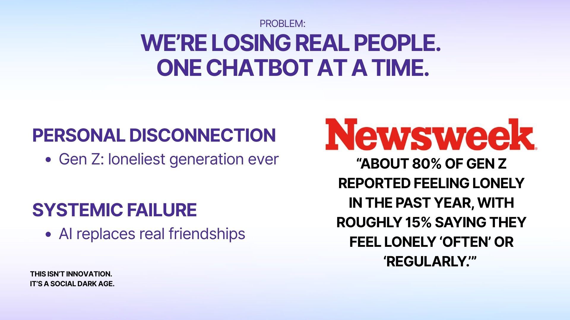
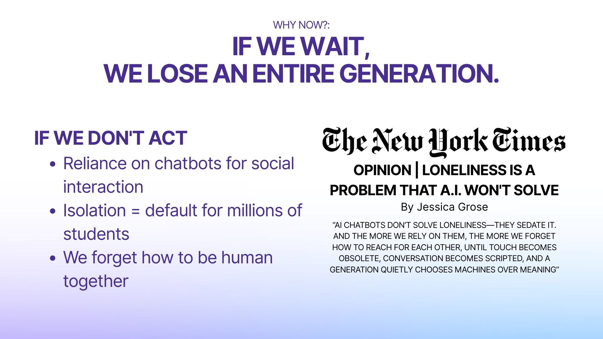
For Boombox, I presented a product concept to non-design stakeholders with limited time and varying priorities. I structured the presentation around the problem, user behavior, and value proposition before introducing design solutions.
Objective: Secure buy-in through clear storytelling and product rationale
For Boombox, I presented a product concept to non-design stakeholders with limited time and varying priorities. I structured the presentation around the problem, user behavior, and value proposition before introducing design solutions.
Design decisions were framed in terms of user engagement, differentiation, and scalability rather than visual preference. Feedback from stakeholders informed how features were simplified and how the value proposition was clarified to better align with business goals.
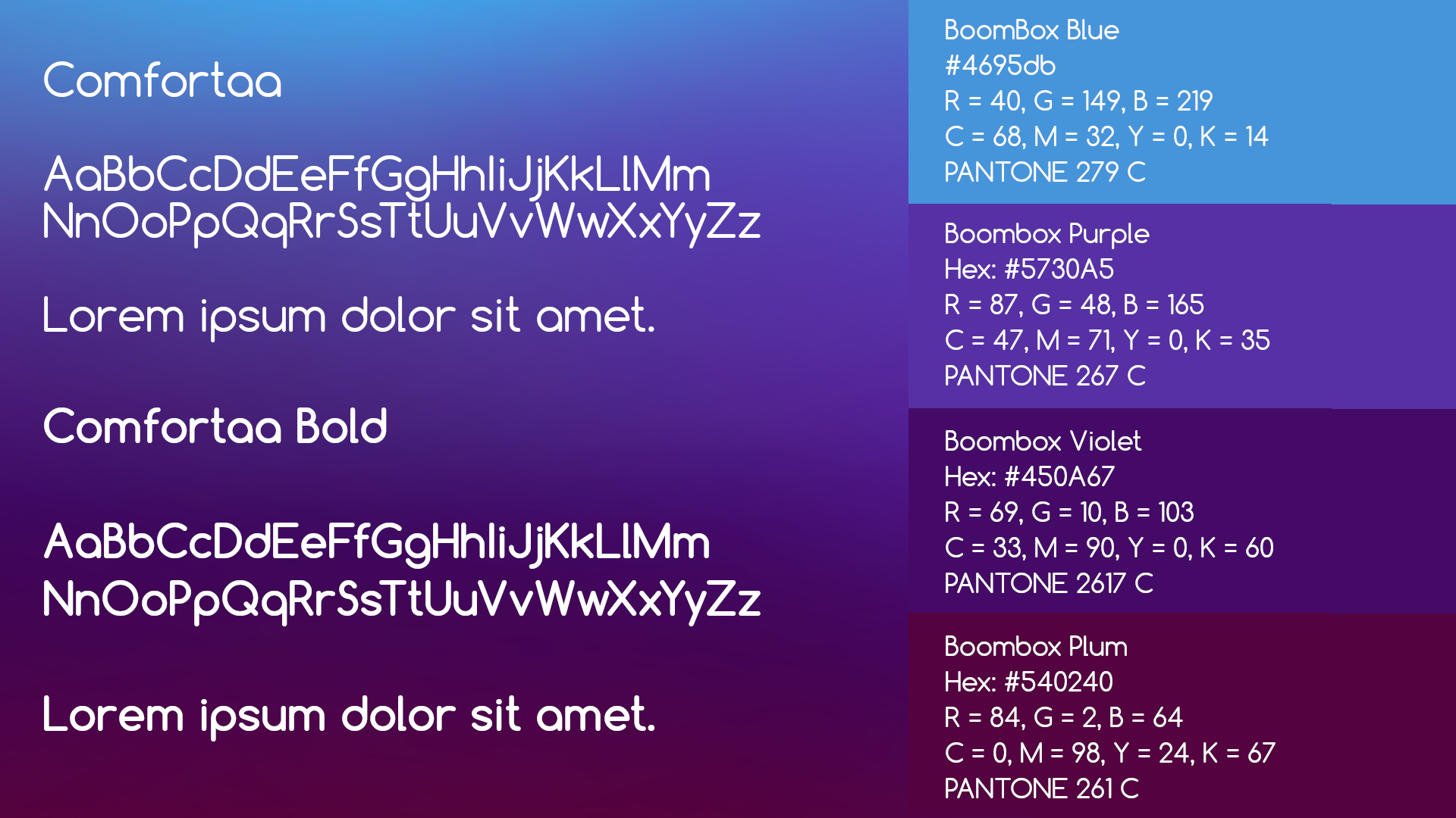
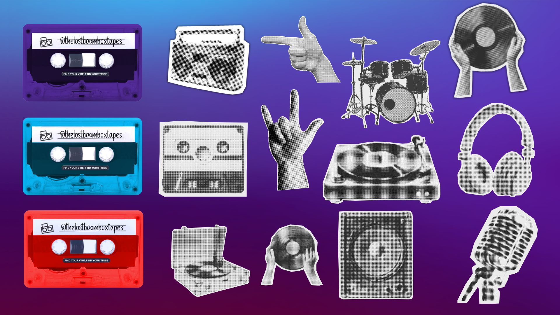
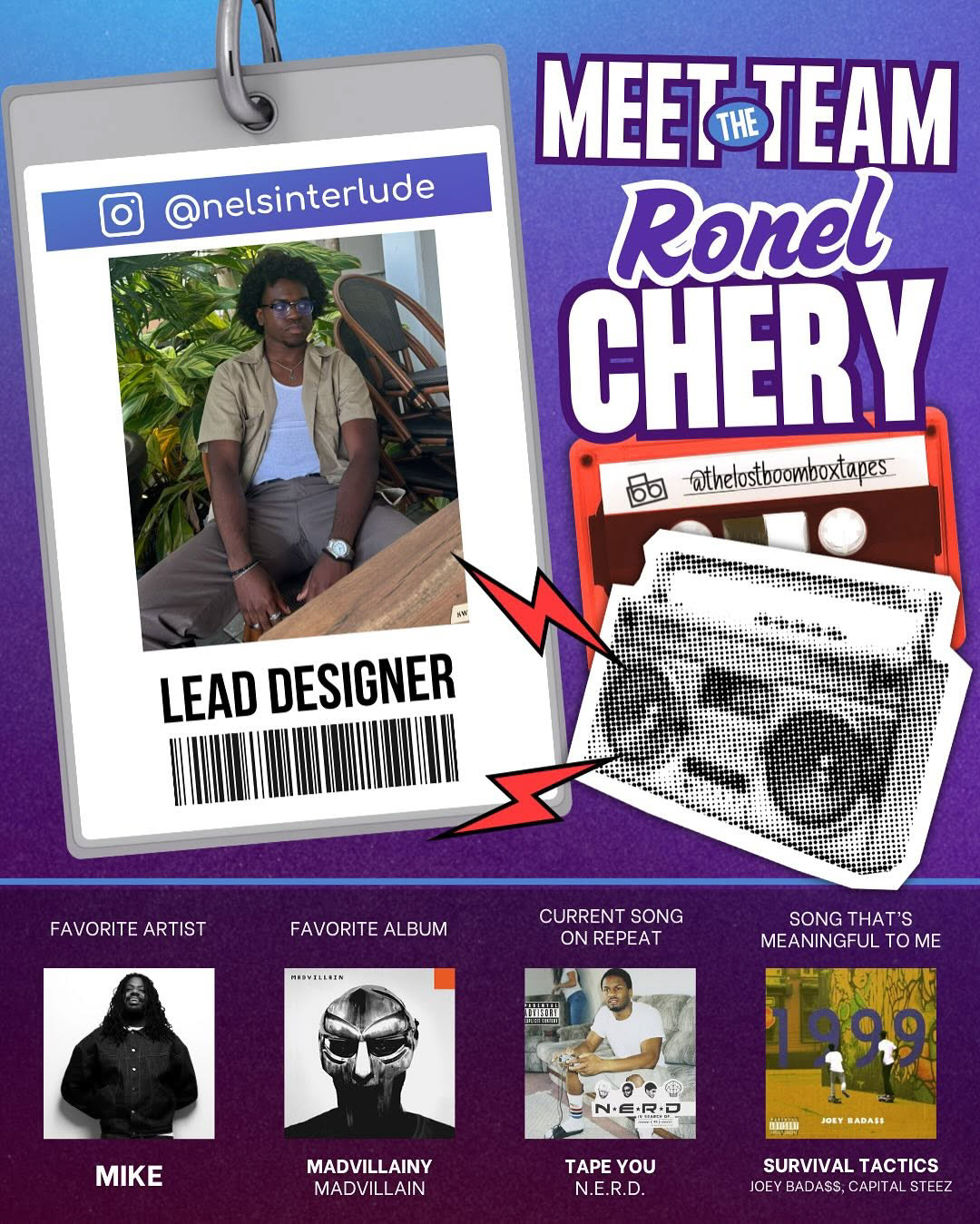
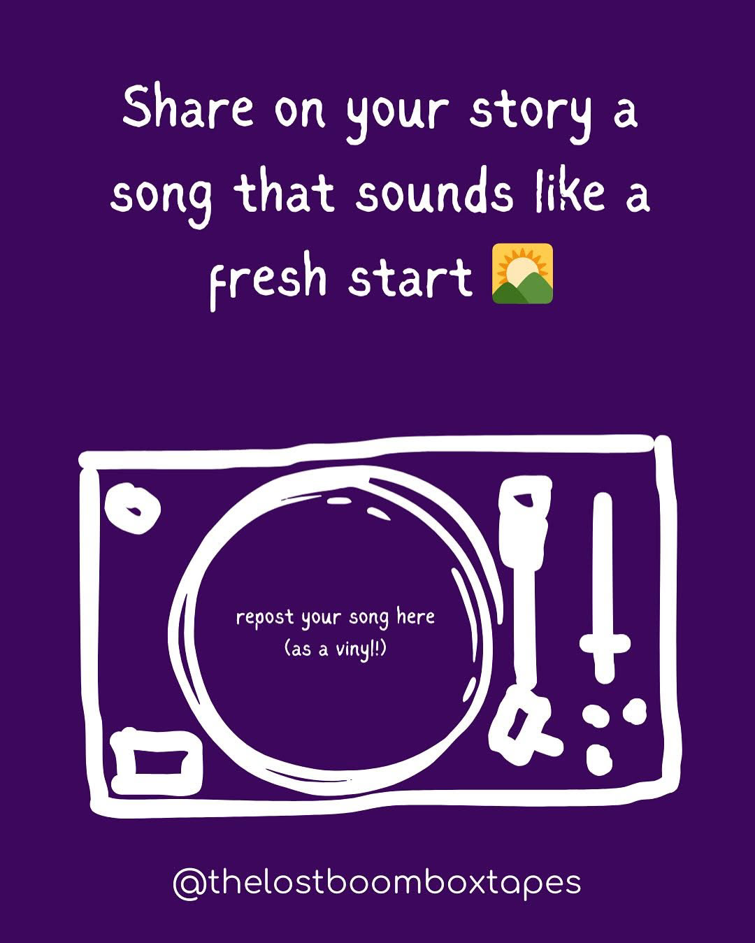
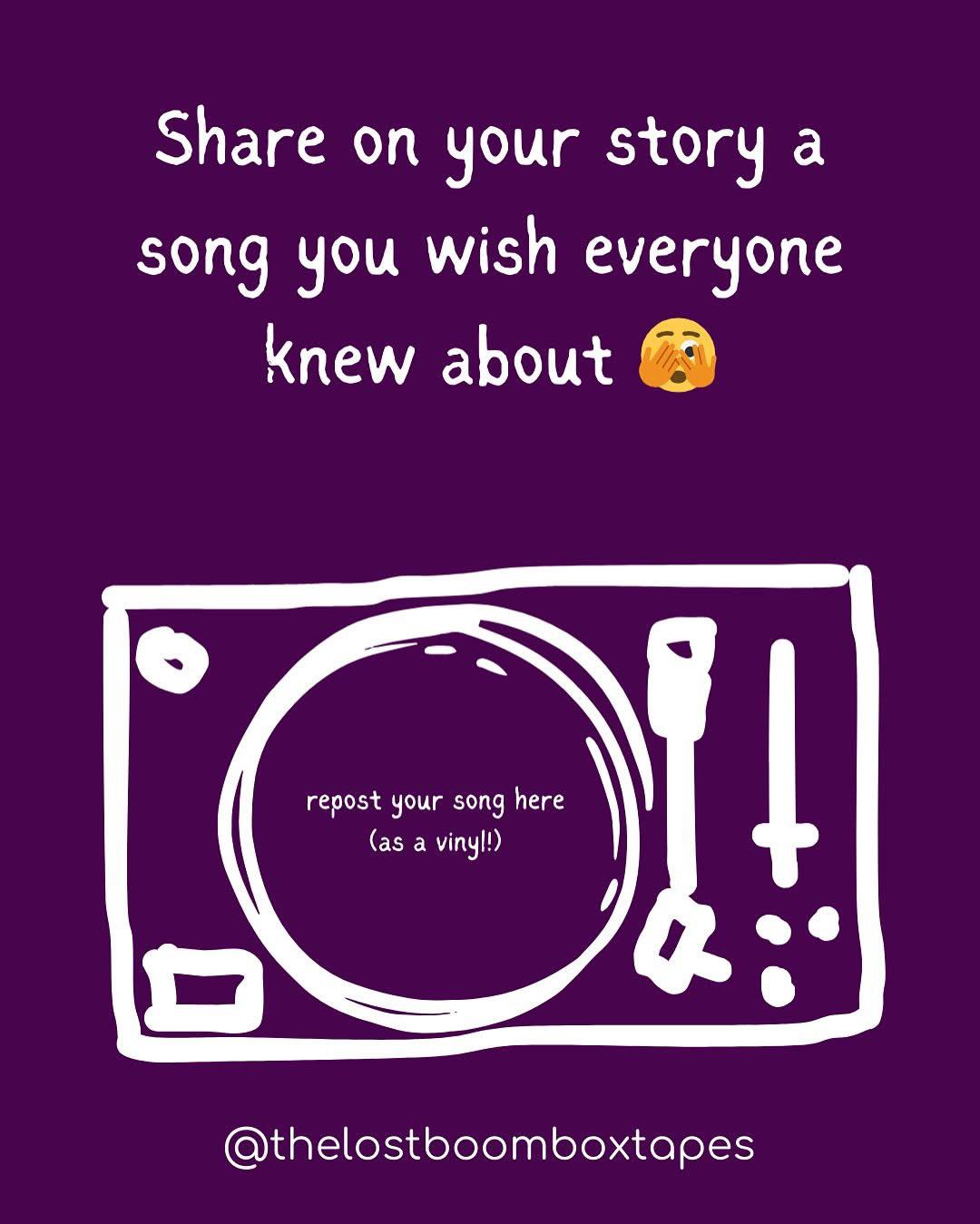
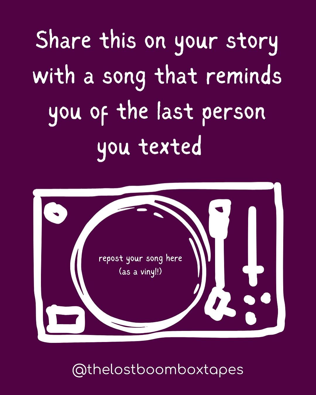
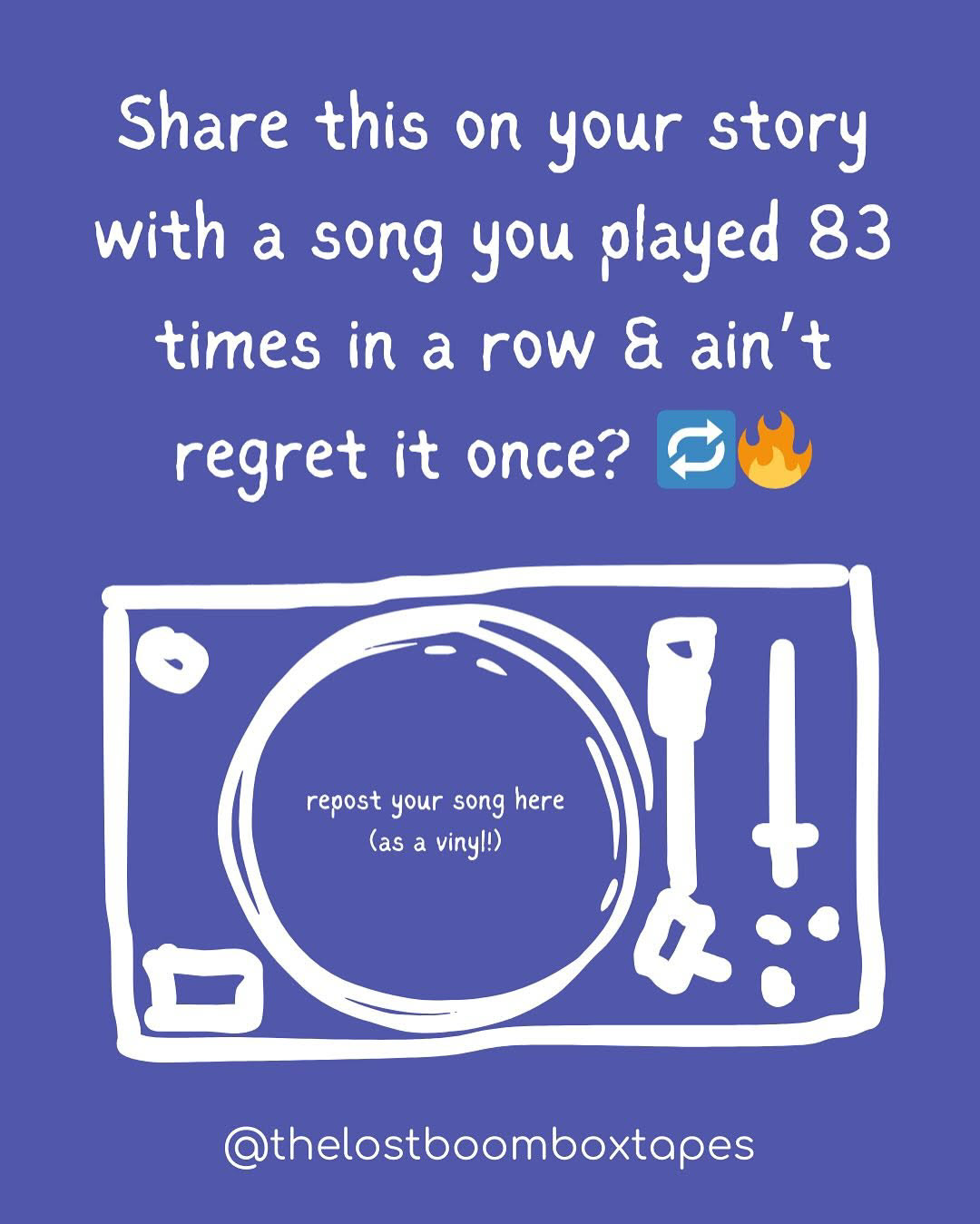
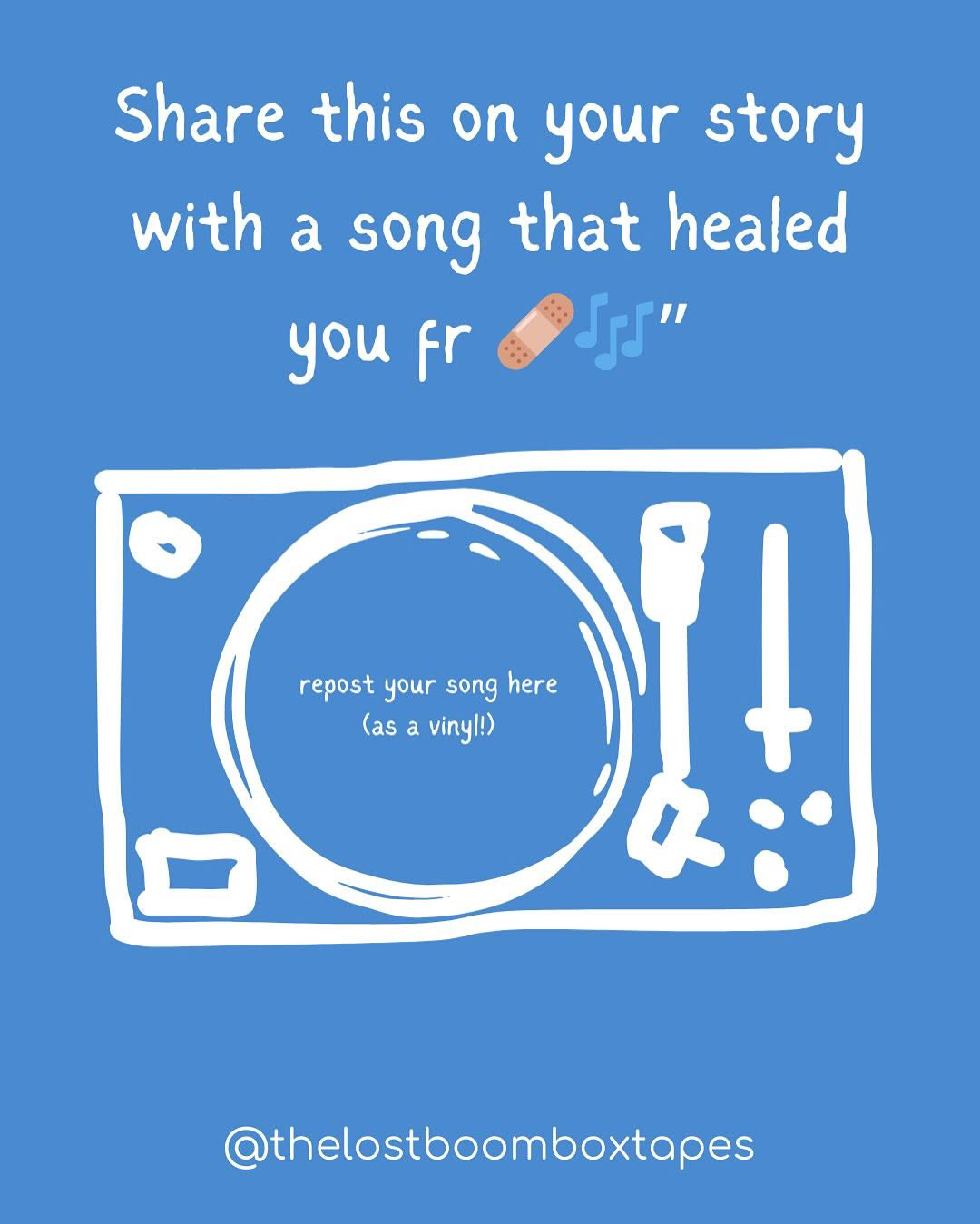
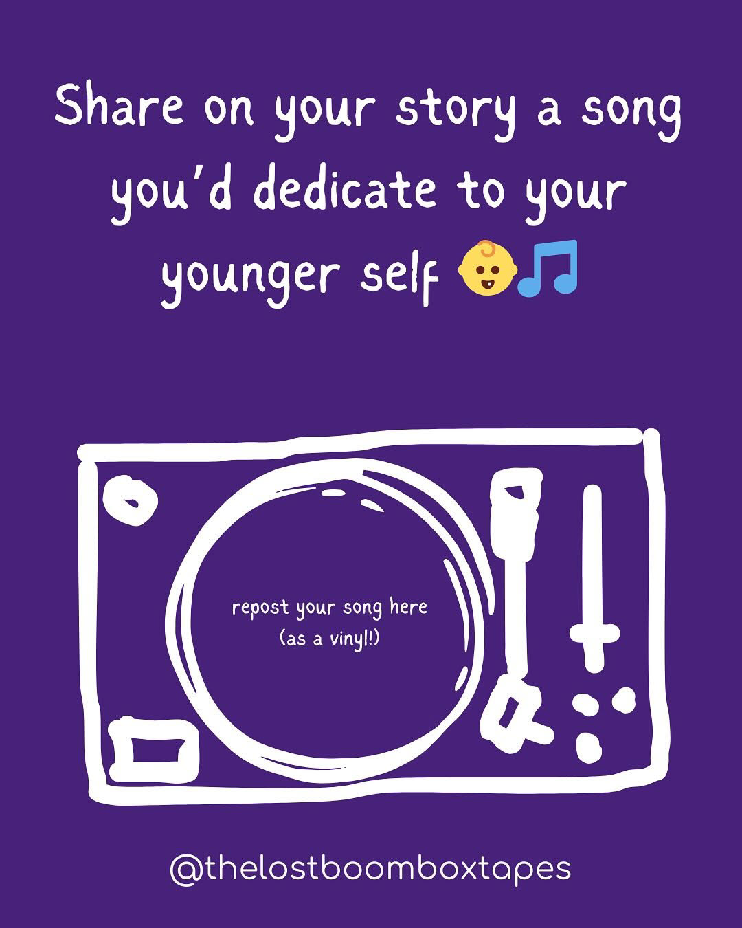
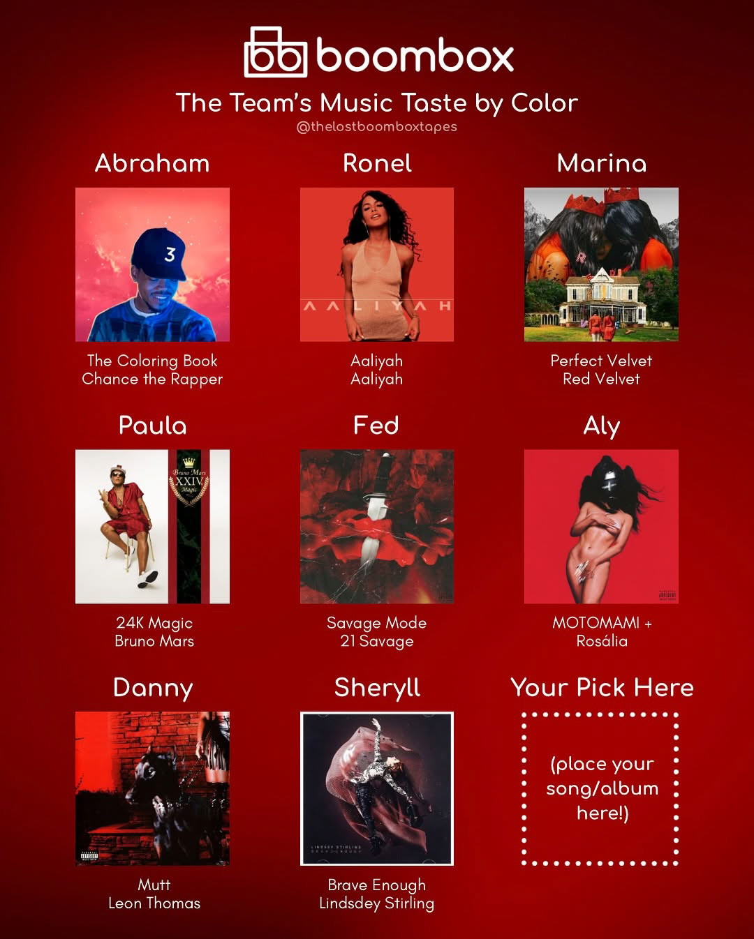
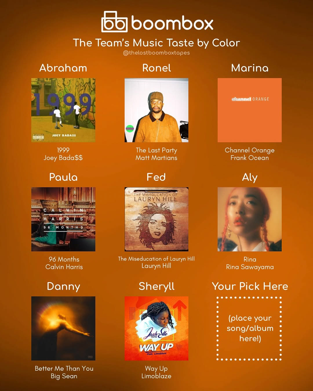
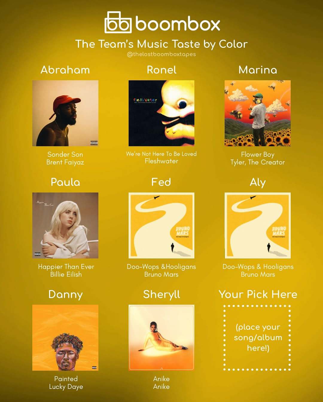
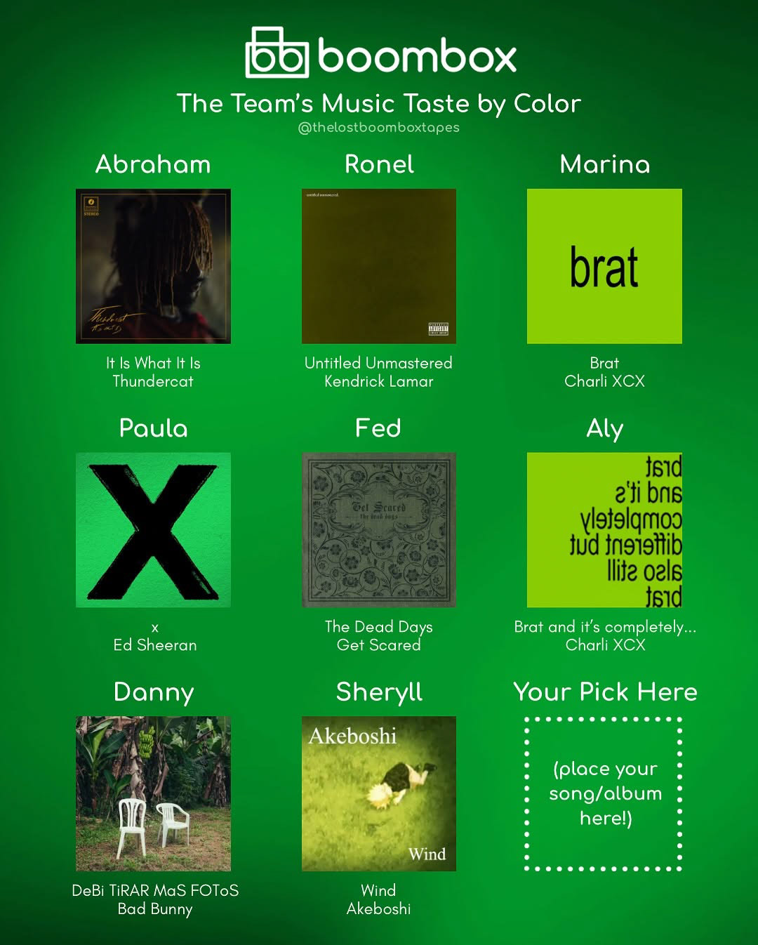
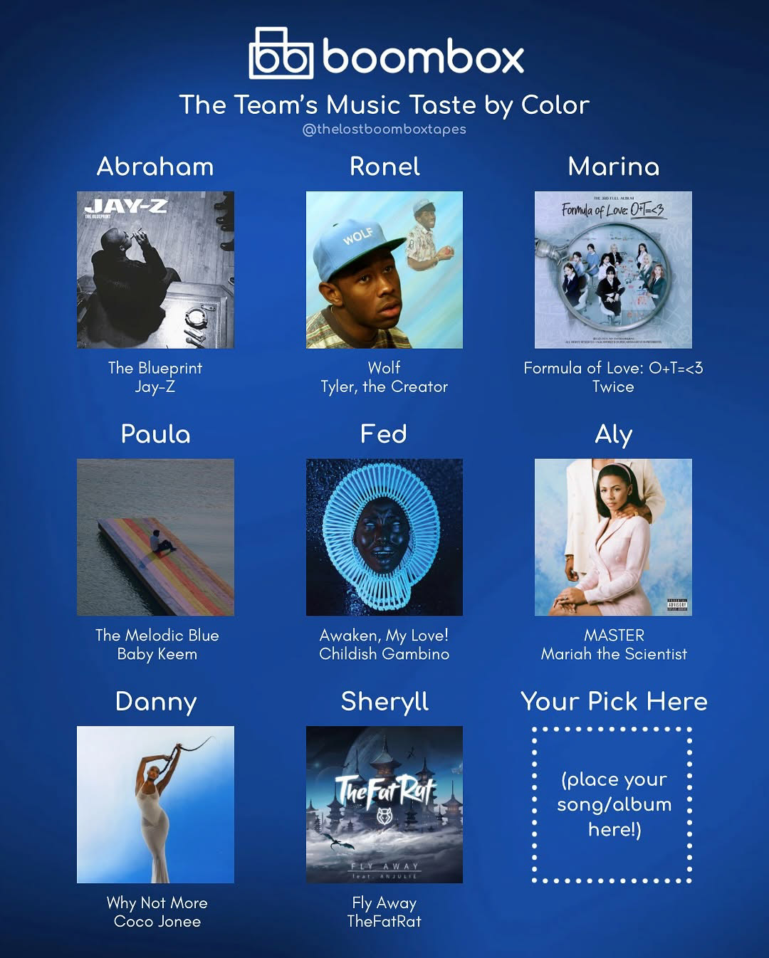
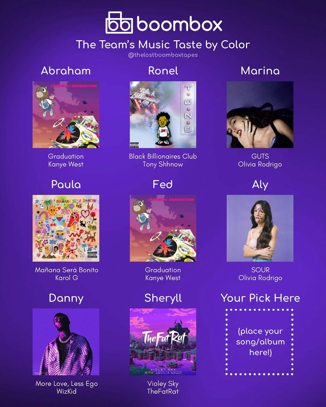
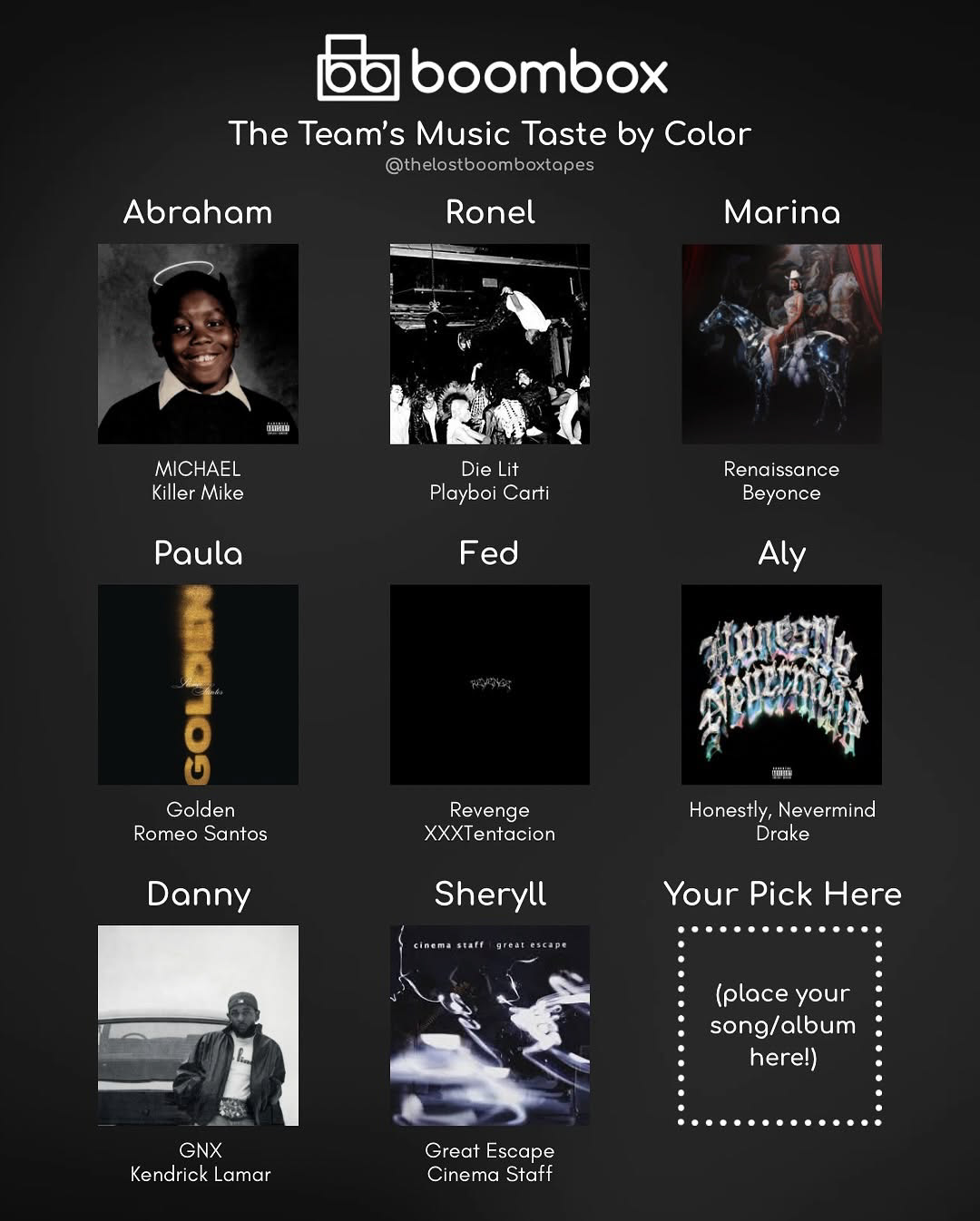
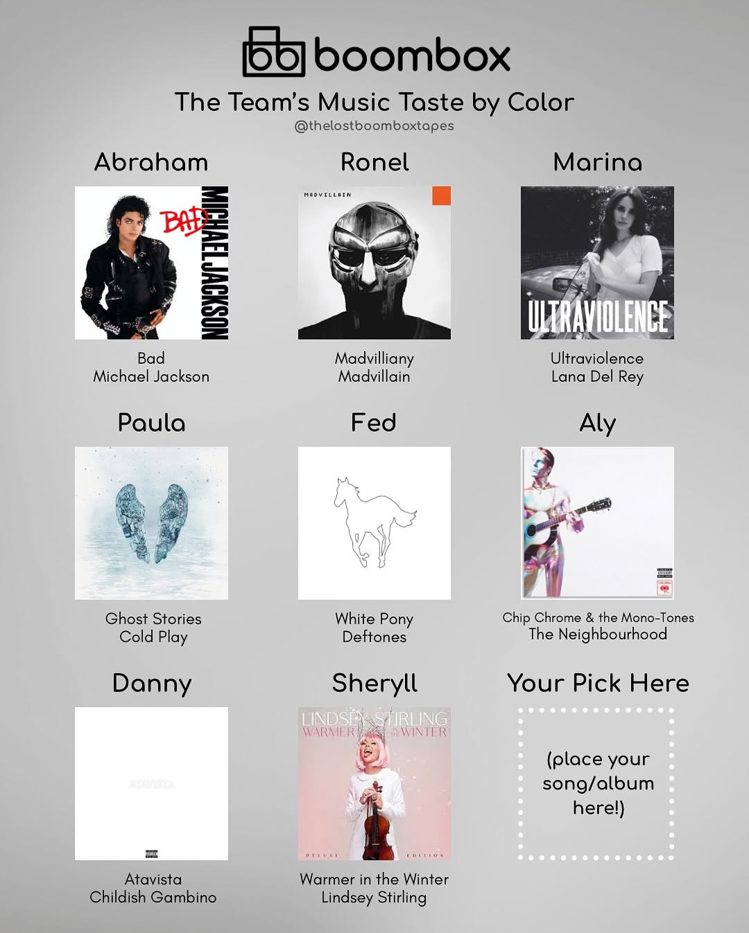
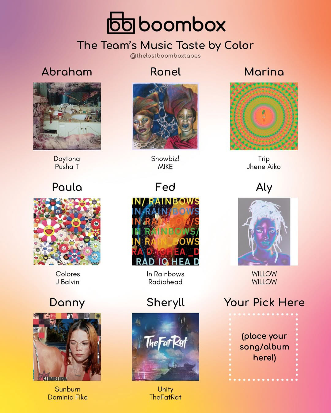
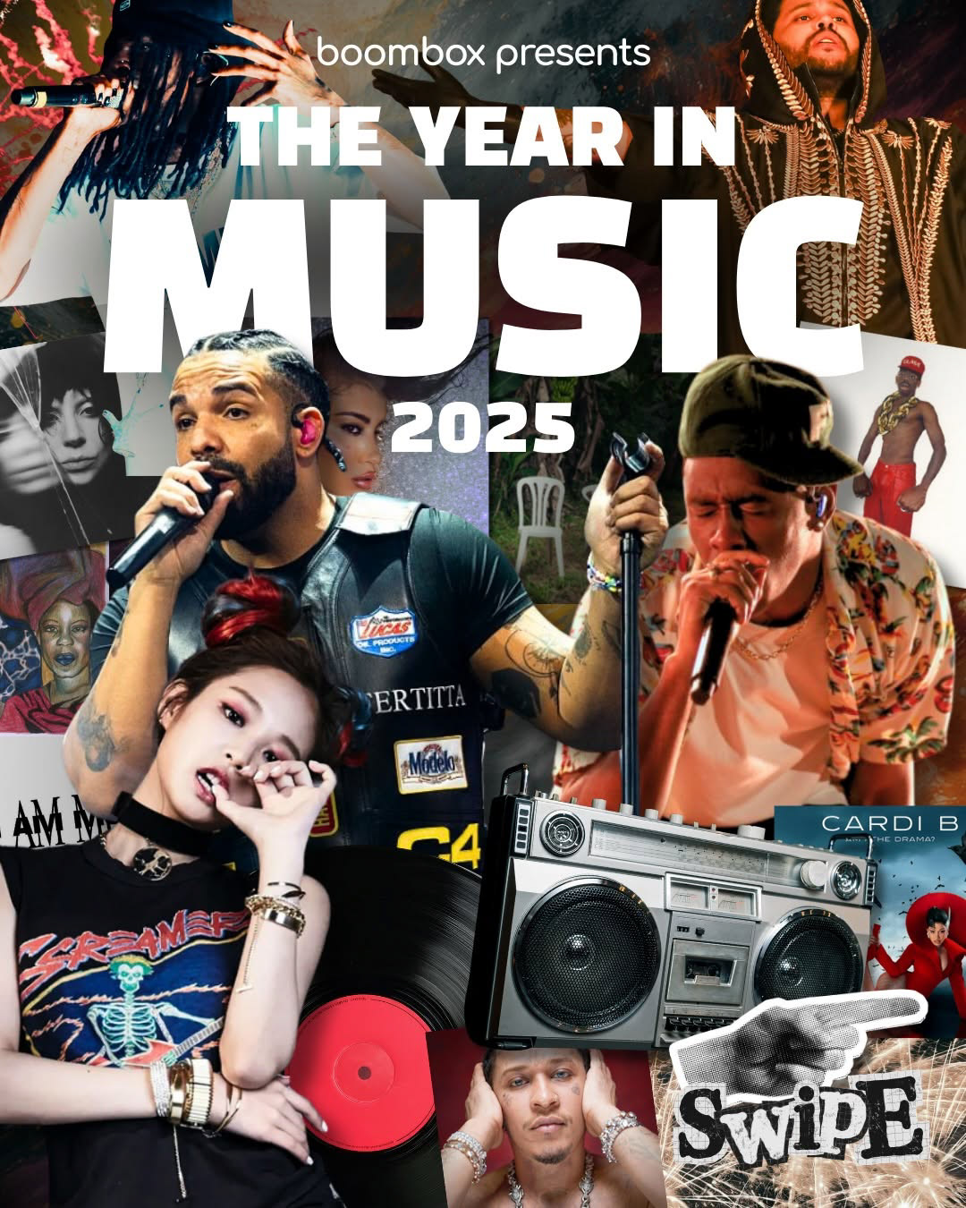
I built out our brand guidelines, choosing the color palette, typefaces, visual style, and motion design. Everything you see on our feed is something I’ve either designed or directed, from the layout and animation to the little details like image textures or how text moves with the beat.
On top of that, I’ve been curating all the visual assets we use, helping plan content strategy, and making sure we stay consistent and creative across every post and platform. The goal is always the same: to make the BoomBox brand feel alive and full of personality, like an album you can't stop listening to and re-visit every week.
This project lets me mix everything I love: design, music, branding, and storytelling, and I’ve loved helping bring the BoomBox vision to life.